
Cash flow analysis
Not a dashboard. A written review of where the cash sits, what moved it, how fast customers actually pay, and what to do about it, with the evidence under each claim.
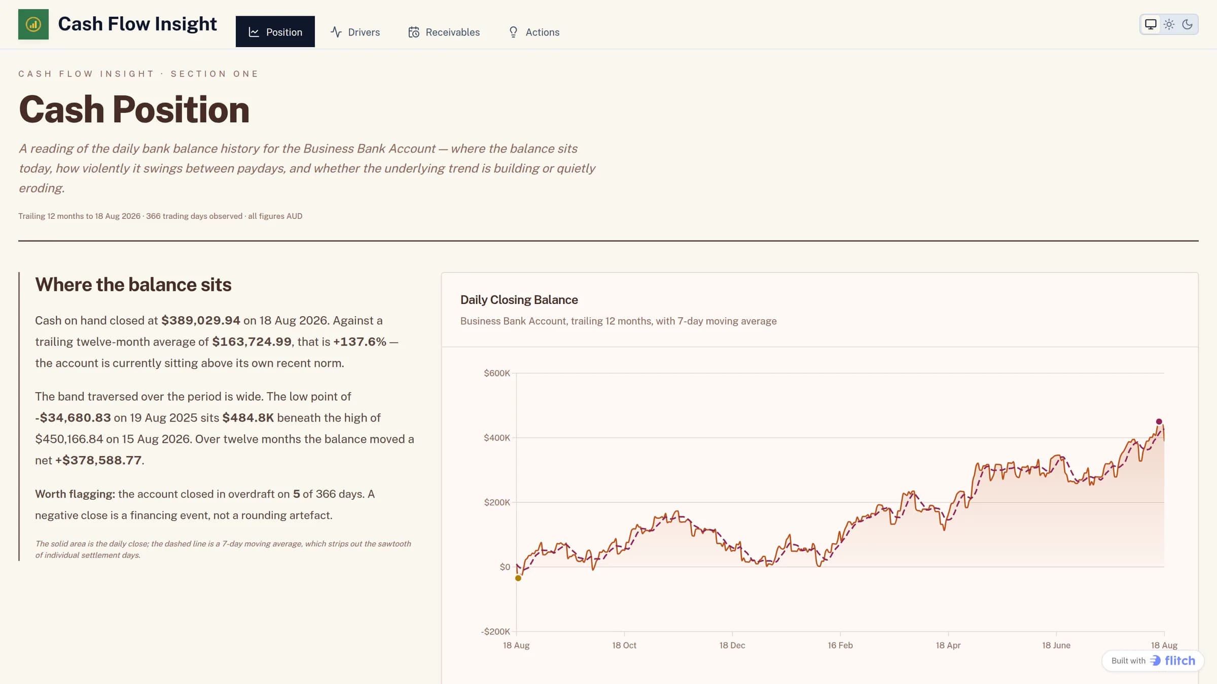
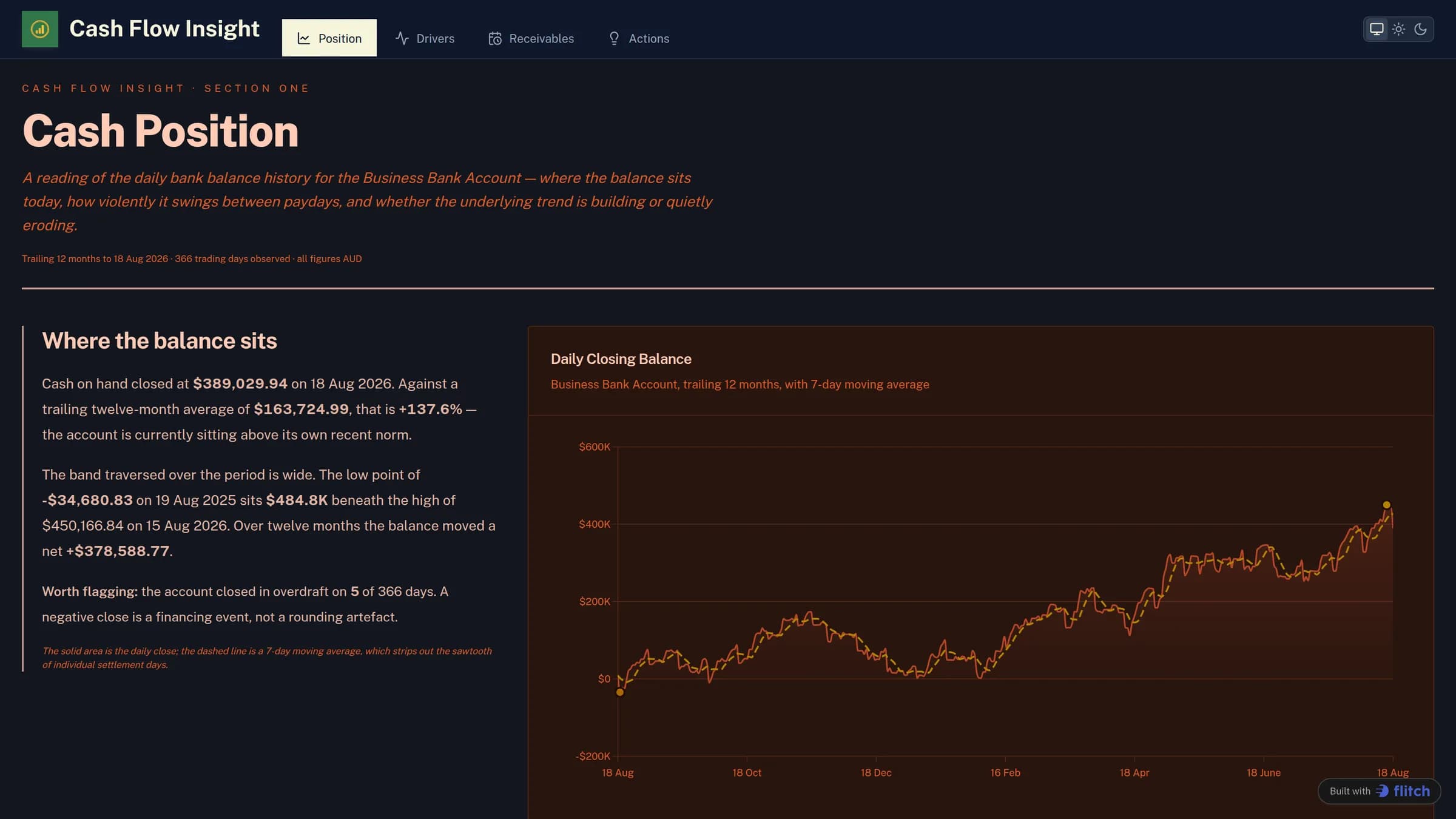
A finance review that reads top to bottom, built in Flitch on Xero data. Each section states a conclusion in plain English and puts the chart or table it rests on directly underneath. It reads like something an analyst wrote, because the figures are in the sentences rather than in a row of tiles.
What the dashboard does
- A stated cash position: where the balance closed, against its own twelve-month average
- The daily closing balance with a moving average over it, so paydays do not read as a trend
- Days the account closed in overdraft, called out as financing events rather than rounding
- What drove money in and out, by account code, with the months that moved the number
- Receivables aging by customer, and how long each actually takes to pay against terms
- A short list of actions, each naming the customer, bill or week it refers to
What data sits behind it
| Dataset | What it carries |
|---|---|
| Invoices | Sales invoices and supplier bills, with status and amount due. |
| Payments | Money in and money out, against the invoice it settled. |
| BankTransactions | Movements that never touched an invoice, including payroll and tax. |
| BankBalances | The daily closing balance, which anchors everything else. |
| Accounts | The chart of accounts behind the revenue and cost breakdown. |
| InvoiceLineItems | Line-level detail, for anything split by account code. |
How it was built
Nobody laid this out by hand. It came from one prompt, against the datasets above, and was refined from there. This is the prompt, unedited.
Build "Cash review", a written analysis of a services business’s cash position
Cash flow analysis FAQ
Why is this not a dashboard?
Because the question it answers is not "what are the numbers" but "what should I do". A row of tiles makes a reader work out the story themselves. This states the conclusion, then shows the evidence, which is how a finance person would actually write it up.
It was built from a single sentence?
Yes. The prompt was one line naming the artifact and the subject. Everything else, the sections, the structure, the charts and the wording, came from the data. Naming the kind of thing you want does more work than describing its layout.
Is this real company data?
No. It is a synthetic Australian services business over 24 months: 912 invoices, around 4.8 million dollars of sales, fortnightly payroll and quarterly BAS. The balance runs genuinely tight in the first year and recovers, which is what gives the review something to say.
Can I point it at my own Xero?
Yes. The datasets carry Xero’s own field names and formats. The one addition is a daily balance table, because Xero returns balances through its reports rather than on the accounts themselves, and a cash review needs something to anchor to.
Start from this one
You get your own copy, with its own data, in your own space. Change anything you like.
Use this template